Experience Direction
Before working full-time at BGG, Lotenna Enwonwu and Michael McPherson worked together inside State Farm’s UX organization, helping improve the systems behind StateFarm.com across information architecture, navigation, design principles, responsive patterns, and delivery practices.
At a Glance
Challenge
Increase UX quality and delivery speed while improving consistency across a complex enterprise digital ecosystem.
Roles
Lotenna Enwonwu — Design & Creative Director
Michael McPherson — UX Manager
Key Work
Research
Information architecture
UX principles
Sitemaps
Wireframes
Global navigation
Responsive typography
Interaction patterns
Delivery systems
Functional specifications
Platform
StateFarm.com
Year
2019




Business Context
State Farm’s UX organization was operating at significant enterprise scale, but the underlying systems and working methods had not kept pace.
The project deck identifies inconsistent design, content-heavy pages, complex information, slow turnaround, and a lack of clear rationale behind design decisions as recurring problems.
The goals were to improve pace, quality, reputation, and the organization’s ability to contribute to broader enterprise initiatives.
Challenge
This was bigger than redesigning individual screens.
StateFarm.com needed a more consistent experience system, while the UX team needed principles and working practices that would make better decisions easier to repeat across hundreds of people and many areas of the business.
Insight
A simpler customer experience required a clearer design system behind it.
Improving navigation or layout alone would not solve the larger problem. The team needed shared principles, reusable patterns, clearer documentation, and better delivery practices.
Strategy & Creative Approach
Research broadly, establish shared UX principles, then create systems that could be reused across StateFarm.com.
The team reviewed experiences from companies including Apple, Home Depot, Nike, Uber, Farmers, GEICO, Progressive, and Allstate, looking at navigation, scanability, content flow, photography, usability, consistency, and tone.
That work informed four UX principles:
Be Simple
Be Easy
Be Familiar
Be Evolving



This is retrospectively to explain the work rather than implying it existed.
Capture
Audit the existing ecosystem and research internal and external experience patterns.
Curate
Create shared UX principles, IA approaches, content hierarchy, typography guidance, and experience rules.
Construct
Build sitemaps, wireframes, responsive systems, navigation, interaction patterns, and public-facing experiences.
Circulate
Create delivery models, templates, documentation, and functional specifications to help teams work consistently.


The Work
Information Architecture
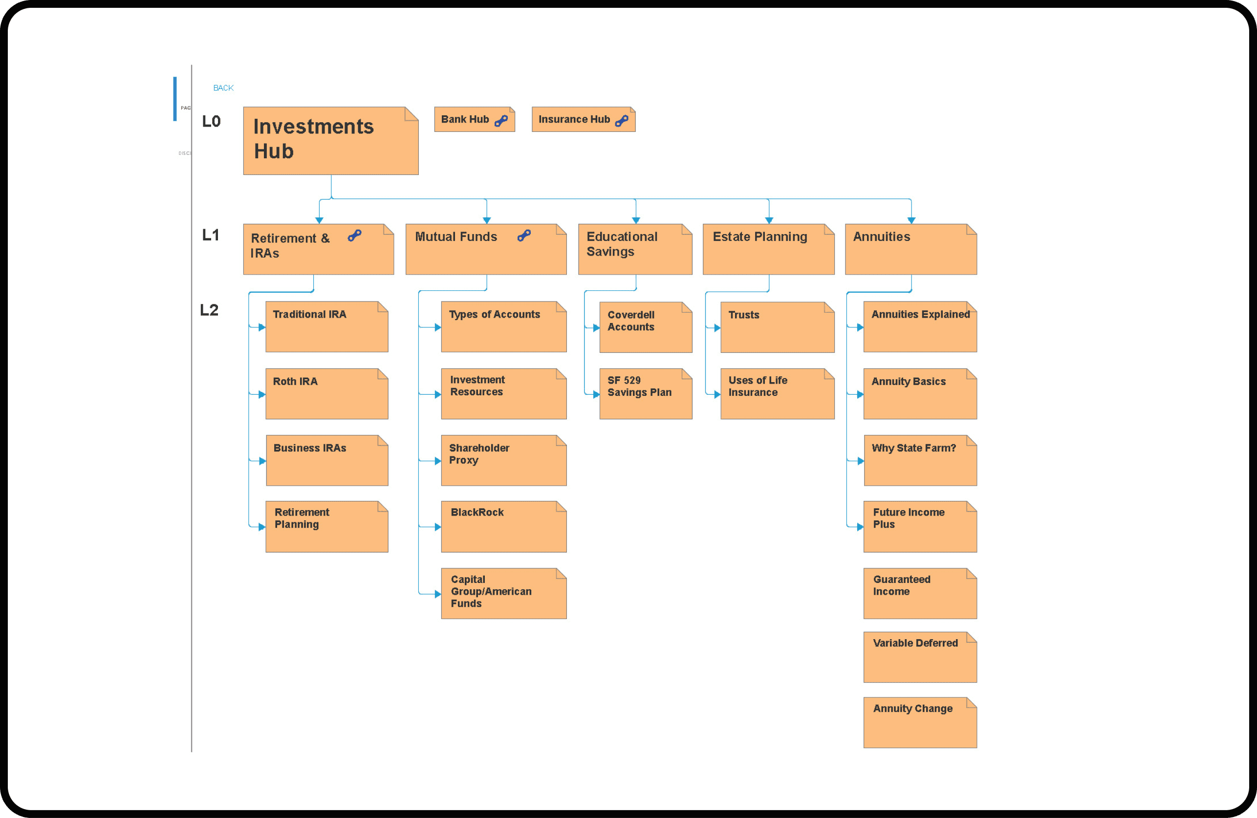
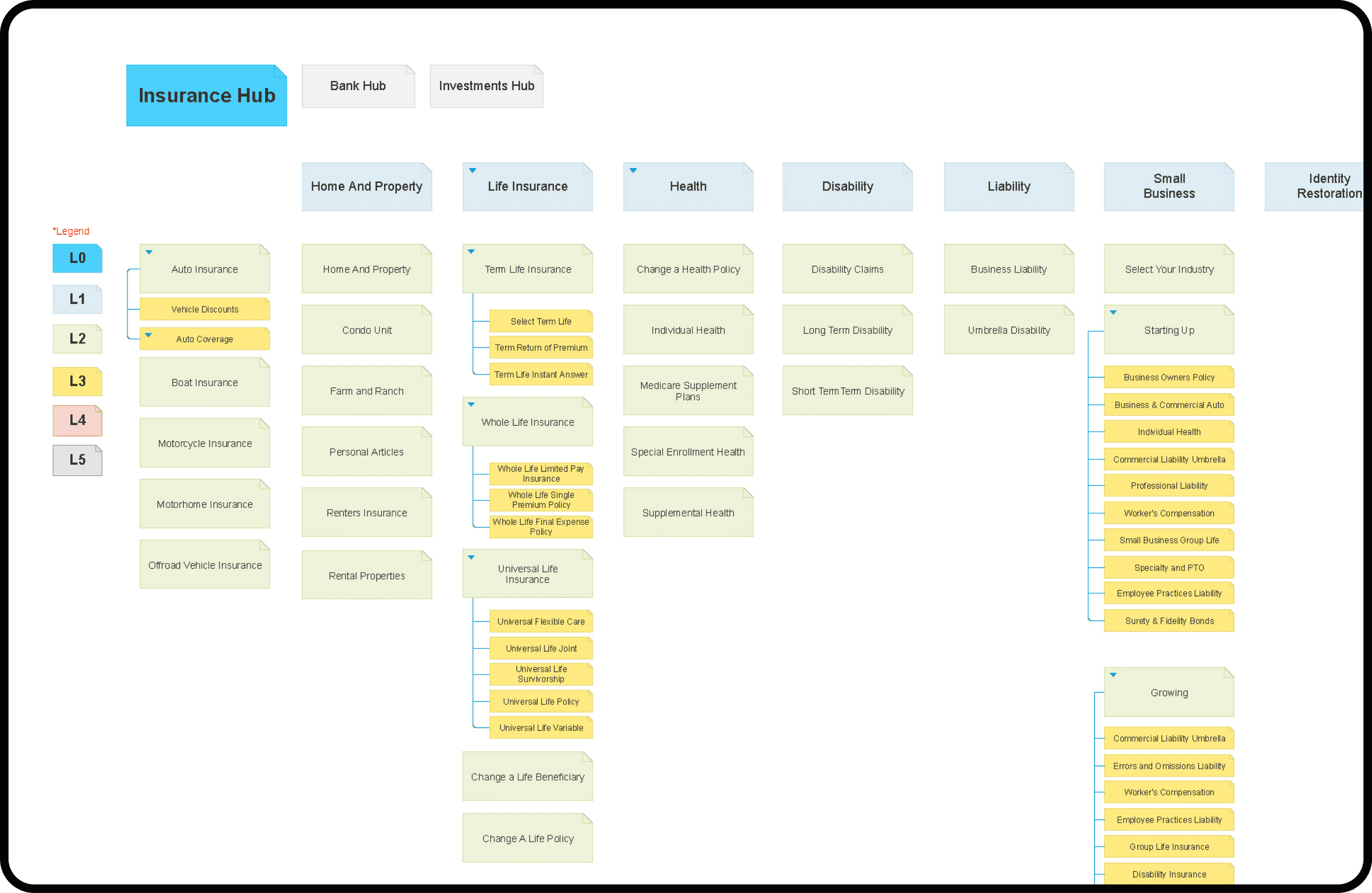
Reorganized Banking and Insurance content into more navigable structures.
Scanability
Rebalanced content and imagery and strengthened typography hierarchy.
Global Navigation
Developed a drill-down approach that gave users access to a broader portion of the information architecture.
Quick Actions
Moved the Quick Action Module into the global navigation.
Design Principles
Created shared UX principles to guide future decision-making.
Design Operations
Introduced Product Delivery Models, templates, and functional specifications to improve transparency and handoff.